SimpleNext.js
How to use Chakra-UI, Choc-UI and Chakra templates with Next.js


Chakra UI
Chakra-UI is a simple, modular and accessible component library that gives you the building blocks you need to build your React applications. In this regards, it is similar to Ant design or react-bootstrap.
Chakra UI distinguishes itself by giving you enough components to cover your needs, with sensible defaults , but at the same time being very extensible and customizable.
Let’s dive a little bit into this great library!
Installation
Inside your React project directory, install Chakra UI by running either of the following:
npm i @chakra-ui/react @emotion/react @emotion/styled framer-motion
Setup Provider
For Chakra UI to work correctly, you need to setup the ChakraProvider at the root of your application. Go to the root of your application and do this:
import * as React from "react"

    // 1. import `ChakraProvider` component
    import { ChakraProvider } from "@chakra-ui/react"

    function App() {
      // 2. Use at the root of your app
      return (
        <ChakraProvider>
          <App />
        </ChakraProvider>
      )
    }
Next.js
Go to pages/_app.js or pages/_app.tsx (create if it doesn't exist) and add this:
import { ChakraProvider } from '@chakra-ui/react';

    function MyApp({ Component, pageProps }) {
      return (
        <ChakraProvider>
          <Component {...pageProps} />
        </ChakraProvider>
      );
    }

    export default MyApp;
Now you can use all the components that Chakra UI offers.
for example for a Button, simply import the component :
import { Button, ButtonGroup } from "@chakra-ui/react"
then you can start use it :
<Button colorScheme="blue">Button</Button>
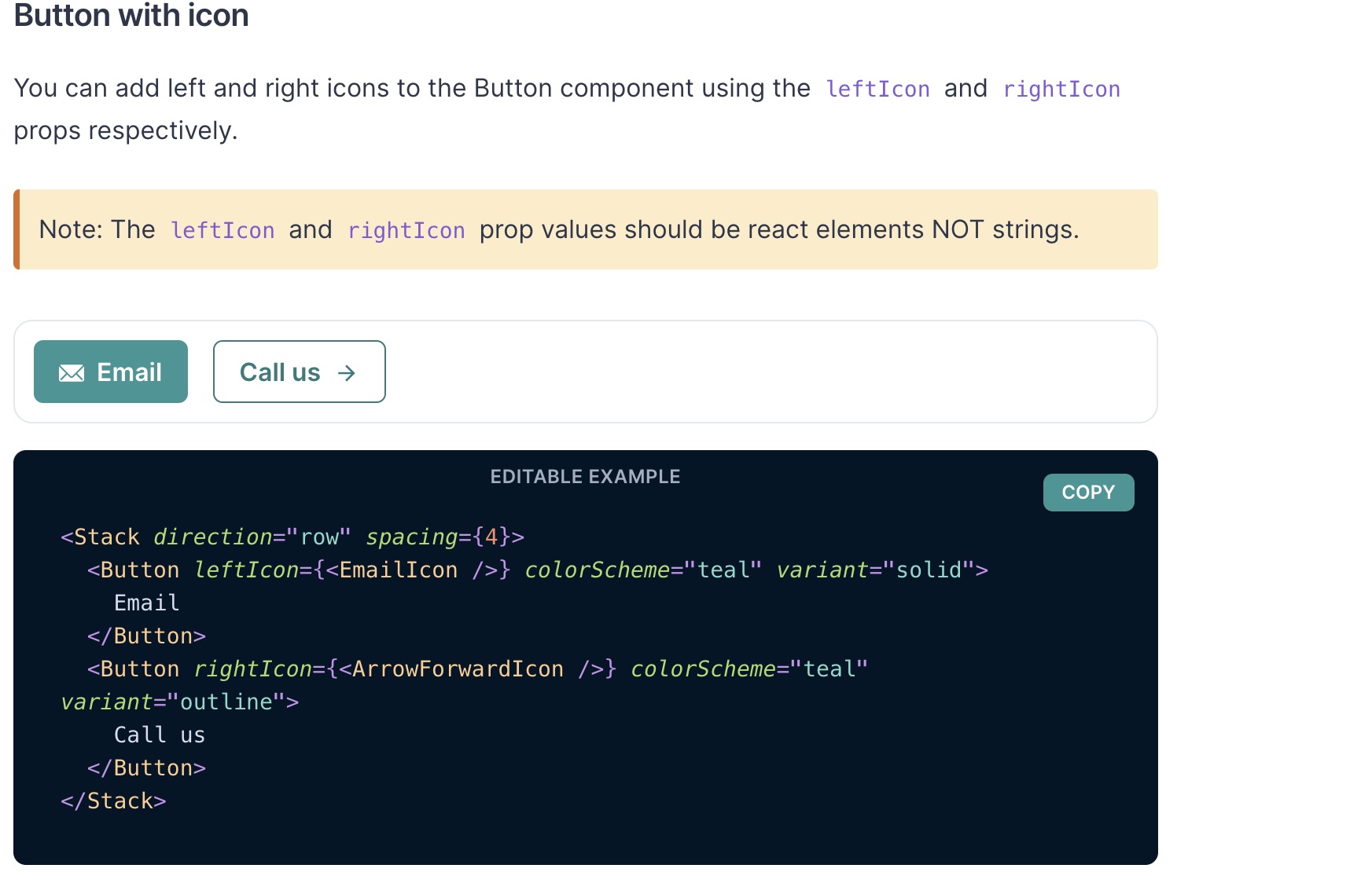
 you can customize your button in multiple ways :
Button with icon, multiple variants, with loading state, social button, grouping button, …
Multiple components are available :
- Button
- CheckBox
- Input
- Radio
- Select
- Table
- Toast
- Alert
- Spinner
- Menu
- Modal
- Avatar
- …
Choc UI
Based on Chakra UI components, Choc UI is a set of reusable components that are commonly used for web applications.
You only need to install Chakra UI as shown previously.
Components Choc Ui offers various components widely used in web applications.
==> Elements
- Alerts

- Badges
- Carousels
- Gradients Icons
- Headers
- Pagination
==> Page sections
- CTA (Call To Action)
- Features
- Heros
- Pricing
==> Navbars
==> Form Layouts
How to implement
For each component, you can find the corresponding code based on Chakra components. You can then integrate the component in your code and customize it by customizing the Chakra components used.
Chakra Templates
Chakra Templates is a set of templates based on Chakra UI components ready to drop in your Next.js application.
These templates include :
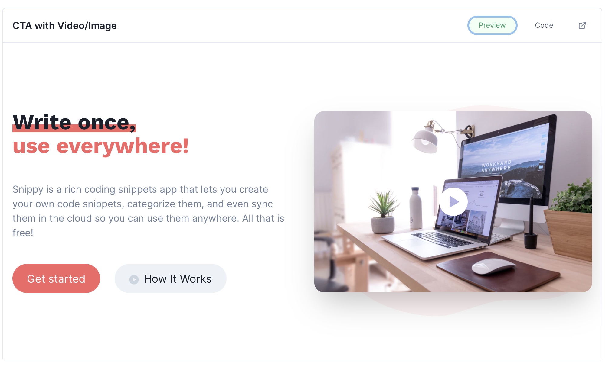
- Hero : CTA , CTA with illustration, CTA with Video/Image, …
- Features section :
- Footer : Large, small, with social links, with Logo, …
- Testimonial section
- Pricing section
- Navbar
- Authentication Form
- NewsLetter Form
- Cards : Social User Profile, Product card, Pricing card, Blog post card, …
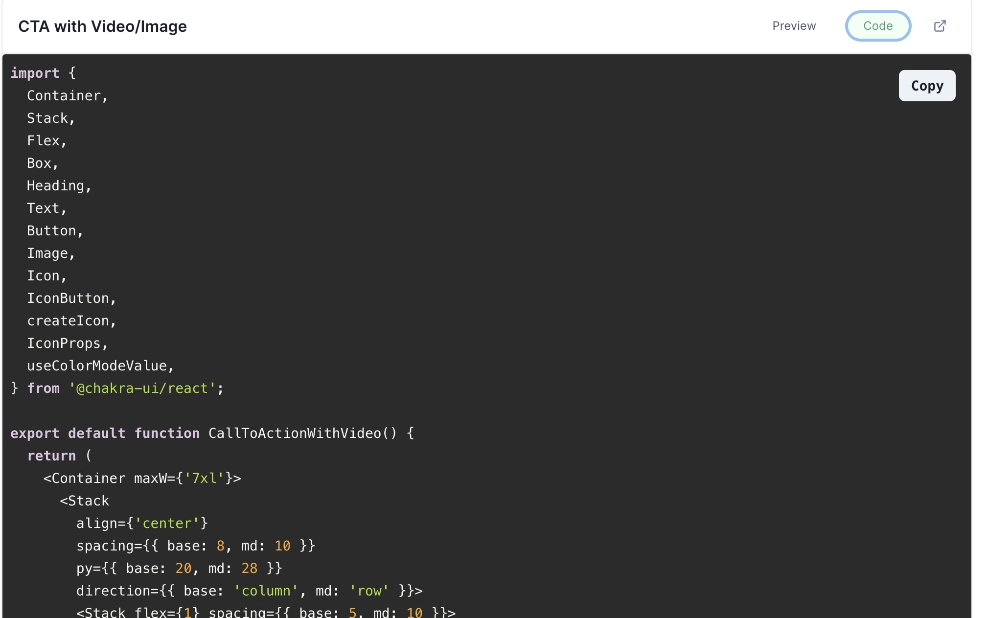
Just like Choc UI, all these templates can be copied then dropped into your application and customized by customizing the Chakra UI components used.
Example for the CTA shown above :
For example, You can create a landing page quickly by composing the Navbar, CTA, Features section, Testimonials and Footer components very quickly.
Conclusion
By using Chakra UI, Choc UI and Chakra Templates, your development process for Next.js apps will be greatly improved,